
Day 90 in Harris County: What the Data Says About Attorney Risk and Paid Loss Severity
By Quaker Analytics Data Science (with commentary from our claims SME team)
Not every claim needs our predictive model treatment—but the best outcomes tend to happen when you can spot inflection points early.
This post is a peek into the kind of deep work our data science team does every day at Quaker Analytics: taking messy, real-world claims history and turning it into something practical for claim teams.
We’ll use one anonymized, real-world-style scenario (with the important disclaimers that we’re not reviewing coverage, liability, policy limits, medical records, or claim file facts here). The goal is to show how Quaker thinks: by timelines, distributions, and decision-relevant thresholds.
TL;DR
For minor soft tissue injury claims in Harris County, TX, the biggest jump in plaintiff attorney representation shows up between 30 and 90 days.
This example claim is ~90 days old and still unrepresented—which matters because that window is where the risk curve steepens.
There’s also a huge severity split in paid loss history: minor soft tissue injury median ≈ $32k vs major soft tissue injury median ≈ $140k in Harris County. That difference isn’t trivial—it changes how you think about reserves, strategy, and “what needs to be true” for a claim to stay in the Minor lane.
The scenario: one claim, one venue, one injury
Here’s the simplified snapshot we’re using:
Claimant: 123456-7
Current reserve: $4,999
Age: ~3 months (90 days)
Injury code: Minor Soft Tissue Injury
Venue: Harris County, Texas
Attorney: none observed as of last week
Even without knowing the underlying claim facts, there are two questions that matter operationally:
Are we entering the “attorney uptake window”?
Is this claim tracking like Minor… or drifting toward Major severity?
1) Attorney representation isn’t random—it has timing
One of the fastest ways a claim’s posture changes is when plaintiff representation appears. So rather than treat “attorney: yes/no” as a static field, we look at it as a timeline-driven probability pattern.

Attorney representation and claim closing timelines (Harris County, TX).
Dark blue indicates plaintiff attorney representation appearing; light blue indicates suit filed. The closing timeline shows how quickly claims typically resolve over 1–5+ years.
Here’s what we’re seeing in the historical data for Minor Soft Tissue Injuries in Harris County:
The largest uptick in plaintiff attorney representation occurs between 30 and 90 days.
This claim is ~90 days old, and still shows no attorney (as of last week).
Why this matters: if you’re building a proactive claim strategy, day 90 isn’t just “three months in.” It’s a boundary line where the historical pattern says representation accelerates. Quaker treats these windows like “decision checkpoints,” not just calendar milestones.
A note from the claim-side reality: defense-side engagement often follows a different curve. In many books, the biggest uptick in defense attorney involvement can show up later (for example, 90–365 days), depending on litigation dynamics and internal workflows. The point isn’t that every claim follows the curve—it’s that the curve tells you when the system tends to change gears.
2) How long do claims like this typically stay open?
The right side of the timeline image is deceptively simple, but it’s one of the most useful questions a claim team asks:
Is a near-term close plausible—or are we settling into a longer trajectory?
Historically, the closing timeline here suggests:
Roughly ~60% close in the first year
Roughly ~85% close within two years
So if the current claim posture suggests it could close in the next ~90 days, that isn’t a random guess—you have historical context that says “a first-year close is common.”
But if the claim is trending toward a longer cycle, the interpretation changes. A longer-than-expected timeline doesn’t automatically mean “Major,” but it can widen the cone of plausible outcomes—especially when you combine timeline signals with severity distributions.
3) Minor Injury vs. Major Injury: the median jump is the headline, but the distribution is the story
Averages hide risk. Medians help, but they’re still only one point. That’s why our team leans heavily on distributional views—like violin plots—paired with a “paid loss ladder” summary.
If you’ve never used a violin plot before:
The width shows where outcomes cluster (wider = more common).
The embedded box and lines summarize the middle of the distribution (quartiles + median).
Outliers still exist (because claims aren’t neat), but you can see how rare they are.
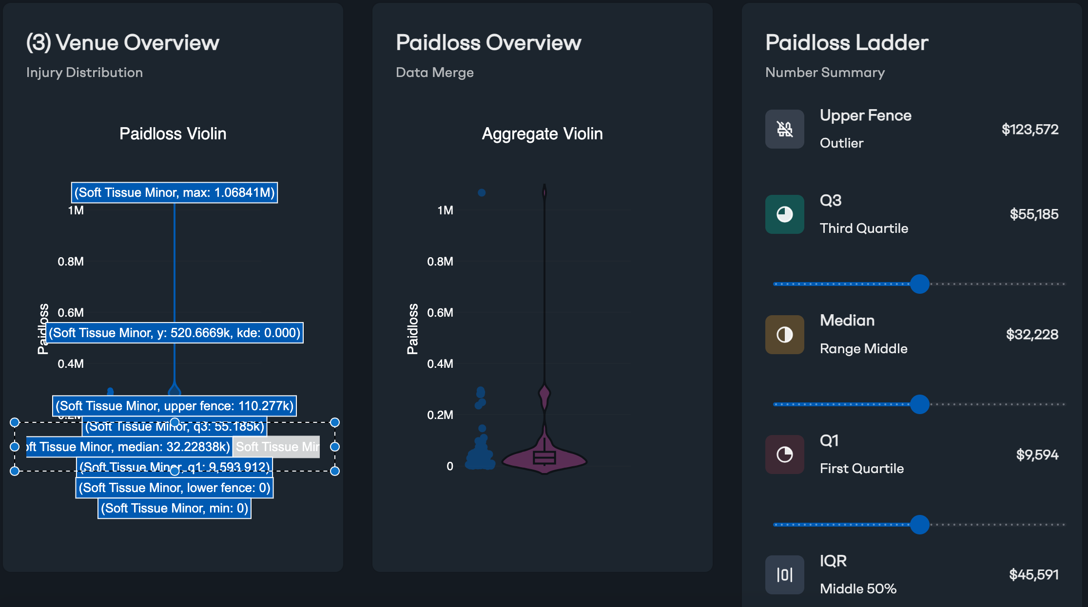
Minor Soft Tissue Injury paid loss distribution (Harris County, TX).
The paid loss ladder shows quartiles and median; the violin shows where outcomes cluster.
For Minor Soft Tissue Injuries in Harris County, the paid loss ladder indicates roughly:
Median: ~$32,228
Q1 (25th percentile): ~$9,594
Q3 (75th percentile): ~$55,185
Upper fence (outlier threshold): ~$123,572
IQR (middle 50% width): ~$45,591
Two takeaways:
The “typical” middle is not huge—but it’s not $5k either.
You can see both the common range and the tail risk (including rare large outcomes).
Now compare that with Major Injuries.
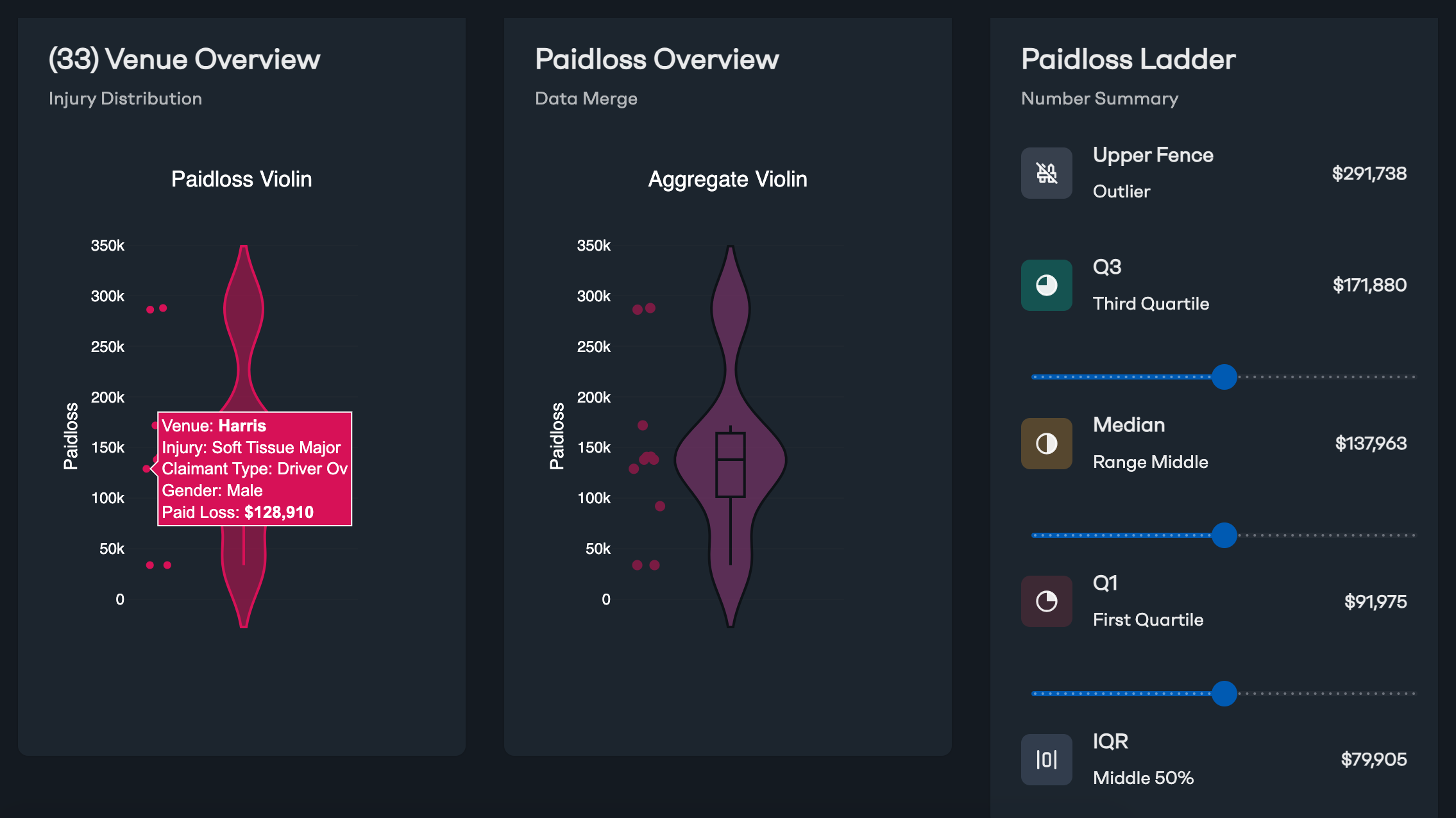
Major Soft Tissue Injuries paid loss distribution (Harris County, TX).
Same visualization approach—very different center of gravity.
For Major Soft Tissue Injuries in Harris County, the ladder shows a very different profile:
Median: ~$137,963 (≈ $140k)
Q1: ~$91,975
Q3: ~$171,880
Upper fence: ~$291,738
IQR: ~$79,905
This is the moment where a lot of “by-the-numbers” people do a double take: $32k vs ~$140k is not a rounding error. It’s a different area altogether.
One of our claims SMEs, Paul Berne, made an important point in internal review: Minor Injuries vs. Major Injuries often reflect materially different definitions, and that makes miscoding less likely than the raw dollar difference might initially suggest. In other words: the data is loud because the categories are genuinely different.
Still, from an analytics perspective, the question becomes:
What evidence would we expect to see if this claim is truly staying Minor?
…and conversely…
What signals would suggest it’s drifting into Major-like territory?
4) Where this becomes actionable (and where Quaker is different)
This is the part that tends to separate “dashboarding” from decision support.
Many tools can show you a single predicted number. Quaker’s approach is to put that prediction inside the context that actually matters:
Time dynamics (when inflection points happen)
Venue context (Harris County behaves differently than other places)
Distribution-first severity (not just “expected paid,” but “where most outcomes live”)
Interactive exploration (filtering by injury code, venue clusters, and toggling raw vs. trended paid loss)
In the example analysis behind these visuals, the claim is currently predicted at a minimum of >$25k. When you place that next to the historical distributions:
>$25k is around the middle of the Minor Soft Tissue Injury range
…but it’s near the very bottom of the Major Soft Tissue Injury range
That doesn’t declare the claim “Major.” It does something more useful:
It tells you what’s plausible, what’s typical, and what would have to change for the claim to meaningfully reclassify in severity risk.
And if your current reserve is $4,999, that’s an immediate prompt for a practical discussion—not panic, not certainty, but a clear “is our current posture aligned with how this venue/injury combination typically behaves?”
The nerdy part, made simple: why we use quartiles and “fences”
A quick note for readers who want the math without the pain:
The “paid loss ladder” is built from robust summary stats:
Median (the midpoint outcome)
Quartiles (Q1/Q3) (bounds of the middle half)
IQR (Q3 − Q1) (spread of the middle half)
Upper fence (a common boxplot outlier threshold—often Q3 + 1.5×IQR)
We use these because claims data is not normally distributed. It’s lumpy, skewed, and full of edge cases. Distribution-aware stats help you stay honest about what’s common vs. what’s possible.
What we hope you take away
This is a small window into how Quaker Analytics thinks about claims:
We don’t just ask “what’s the expected paid loss?”
We ask “what does the distribution look like in this venue, for this injury, at this point in time—and what are the real decision thresholds?”
The best claim outcomes often come from acting early, staying realistic about risk, and using historical context to avoid both overreaction and under-response.
We can turn this same framework onto your own book of business—so your team can see attorney timing patterns, closure trajectories, and severity distributions in the places and injury categories that matter most to you.